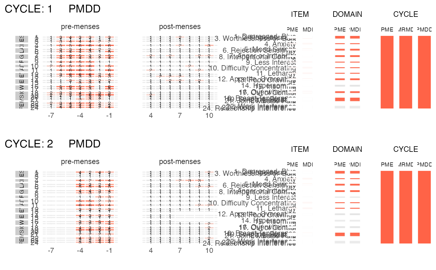
Visualize all the observations of a single subject.
plot_subject_obs.RdThis function visualizes the scores (raw data) reported by a subject.
It also internally calls the cpass function to provide
a visualization of the diagnosis at the ITEM, DSM5 DOMAIN and CYCLE level.
Usage
plot_subject_obs(
  data = data.frame(),
  add_diagnosis = TRUE,
  color_max_score = "tomato",
  silent = FALSE
)
Arguments
- data
a
cpassdata frame that contains the symptoms reported by ONE subject.- add_diagnosis
logical. If
TRUE(default), the diagnoses at the ITEM, DSM5-DOMAIN and CYCLE levels are displayed together with the subject's reported scores. IfFALSE, only the reported scores are displayed.- color_max_score
string specifying the color of a score of 6 (the maximal score) reported by a subject. Any standard color format specification is accepted, i.e. one of the R built-in color names (e.g. "tomato" (default); type
colors()to see the names of all R built-in colors), an RGB hex code (e.g. "#AA2199") or a color specified via one of the color/palette functions (e.g. hsv(0.1,0.9,0.9))- silent
a
logicalspecifying if the function should print messages or run silently. Default isFALSE.
Examples
library(magrittr)
library(dplyr)

data(PMDD_data)
input <-
  PMDD_data %>%
  dplyr::filter(subject == 2)  %>%
  as_cpass_data(., sep_event = "menses")
#> Number of subjects:  1
#> Total number of cycles:  2
#> Percentage of missing scores:  13.1 %
#> Warning: The 'phase' column will be over-written
#> Percentage of missing scores
#>           (in pre- & post-menstrual phases):  13.1 %
plot_subject_obs(data = input)
#> PME diagnosis is still experimental and has not be validated clinically. Please, use with caution.